Our approach to applying network analysis in neurosurgery.
Here are a few examples of analysis approaches and statistical techniques applied to neurosurgery.
The aim is to provide clear & relevant examples, taught using a 'nuts and bolts' approach. Hopefully this will make
the methods memorable, de-mistify how statistics are performed, and allow a more inquisitive approach to doing research
(regardless if one is a student, doctor, or just interested). Approaches we will cover are: non-parametric tests;
time-to-even data; principle component analysis (PCA); independent component analysis (ICA); correlation & regression;
binomial testing (for sensitivity & specificity); & continuous data (t-tests & ANOVA).
A New Treatment: blinded, paired, non-parametric comparisons
Lets say we want to assess the effectiveness of deep brain stimulation programming, called "4everstim".
We wish to compare this with standard stim, and decide a paired study design would be nice (to minimise variance
between arms). We would also like to do this in a blinded fashion. All very laudable so far, and quite a common
trial design situation when we wish to compare a new intervention that is amenable to blinding and pairing
From a practical point of view we will need to include blocks of the different stimulations that are
randomised between participants (so the participants can't guess that the first stimulation is always the trial, or
investigators can't plan to add the intervention to a fixed epoch that they believe will work better). So what data
will we get? We will know the number of participants, plus their scores for each of the two interventions, and maybe
a baseline too. The scale used to provide the score is important, but in this case we will make it an interval
scale (i.e. values reflect severity) and its distribution is symmetric (which we could explore and maybe test).
So how do we test these data? Well one approach would be a simple t-test between the different arms.
This would not be ideal as it doesn't account for the pairing of data, or the interval scale used (which it treats
like a continuous scale). Therefore what we need is a paired ordinal test, like the Mann Whitney U. Lets explain this
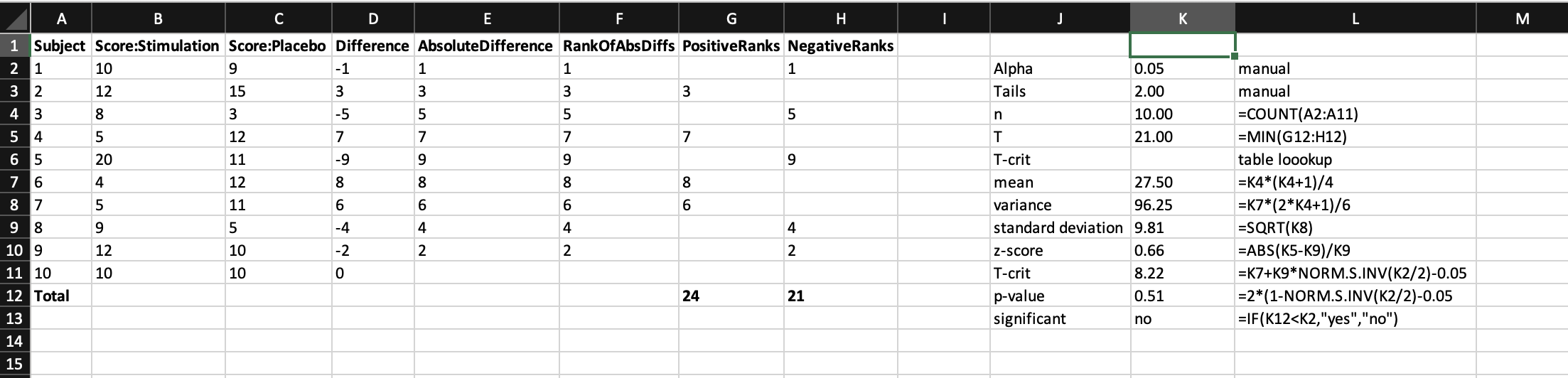
with the data. We arrange our participants in rows (so we can easily add more), there scores in the adjacent columns,
then calculate difference scores between the two individual scores (whereby 0 = no difference, and + or - is in favour
of one particular arm that does better or worse, respectively). We then rank these difference scores, and sum the ranks
for each arm. This then gives us all the information we need to look up the test statistic in a table to determine
its significance. Below is what it looks like when all nicely laid out, which I think should help with understanding
[with huge gratitude to
Real Statistics
for the inspiration].
Infection rates: time-to-event (censored) data
Understanding what interventions can be used to reduce infection is paramount to any surgical approach,
and naturally has a key role in functional neurosurgery with implanted devices. When reading a paper on a new intervention to
reduce infection, a common question is "what was the percentage reduction in infection rate?" But why is this wrong
To answer that, one has to understand what the actual data input is. Lets take an example of a new kind of
external ventricular drain tubing called "4everclear." In this type of analysis, the data we will known are the
number of participants enrolled, whether they got an infection, and if so when. What we will also know is for
those that didn't get an infection how long they were in the study for. This means that for some people they will
only contribute data for the duration that they were in the study (e.g. they may have come out of the study because
their EVD was removed or they died or the study finished collecting data at its planned close or they simply
pulled out). This is called 'censored' or 'time-to-event' data.
So what do we do with censored data? For a start, simply contrasting occurrences at a fixed time
point (e.g. percentage infection at 30 days) isn't ideal as it fails to adequately describe the drop off in numbers of participants
at this time point, and is at risk of arbitrary time scales (i.e. if infection is no different at 30 days, what about
31 or 28?). Moreover, using this simple approach fails to account for the richness of the data, in that we also know
how the event of interest (infection) occurs at all time points, as well as censoring of data.
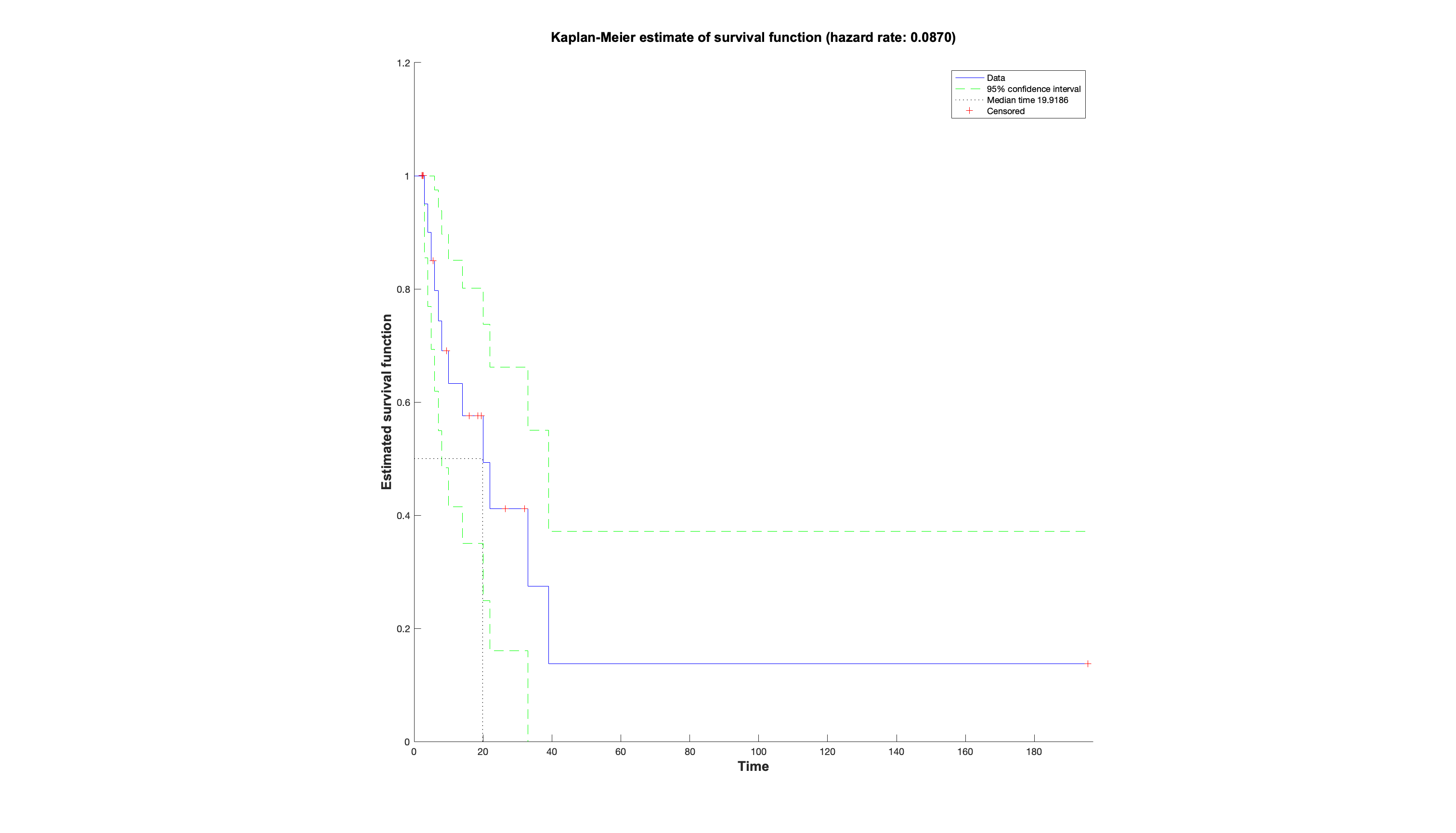
And this is why the hazard plot was invented, together with the hazard ratio. In this approach the hazard
is the event of interest, and the hazard ratio can be thought of as a relative risk between two arms over time that
accounts for censoring. The x-axis represents time. Both arms start at 100 on the y-axis, defined as 100% of the population has not had the hazard. The
curves then take steps down from 100 when an event happens, the height of which depends on how many remain in the study
at that point (hence the steps look larger towards the right when there are less people left). The ticks represent
when someone was censored, and hence the next step after this will be larger. Often the raw numbers of those remaining
at important timepoints are summarised below.
So in conclusion, next time we read a paper regarding interventions for infection - or indeed
any paper dealing with a rate over time, which we now know will involve censored data - ask not about percentages,
but about hazard ratios, and demand to see the hazard plot (always inspect the raw data). In some ways this is more
efficient than reading the paper, as all you really need to see are the methods for what was done, and the hazard plot,
then you can make up your own mind.